Suidata Suidata

Suidata | Explore Global Mortality
1979-2016

This is a revamped project that was a requirement for CSE3 Analytics Programming. Mainly to preprocess and visualize data but in the web.

Tools Used
  • Ctrl + C and Ctrl + V by Larry Lester.
  • GADM Dataset
  • World-geojson by AlexGouget
  • Map simplification: Mapshaper

Disclaimer: This project is for non-commercial purposes only and was created as a fun way to practice map APIs and data visualization techniques.

Created by: Godwin Duliente

A Data-Driven Journey Through Four Decades of Global Mortality

Discover interactive charts, maps, and filterable data to explore trends in suicide mortality across countries, age groups, and genders, all based on the comprehensive WHO Suicide Statistics dataset from Kaggle.

Data Visualization and Analysis of WHO Suicide Statistics

Welcome to a course project requirement in fulfillment of CSE3 Analytics Programming. This data visualization project utilizes the WHO Suicide Statistics dataset, spanning from 1979 to 2016, to visualize and analyze suicide mortality across countries, age groups, and genders.

Scope and Limtations

While the WHO dataset is a valuable resource, it's important to acknowledge its limitations. Not all countries are included, and data availability and quality vary across countries and time periods. Additionally, underreporting of suicides is a known issue. We strive to be transparent with viewers about these data limitations and encourage interpretations of our visualizations with these caveats in mind.
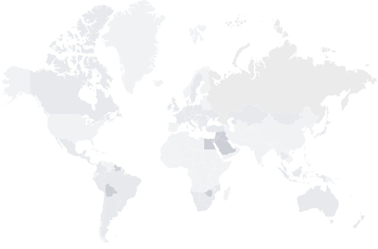
Data speaks louder than words, know the ins and outs of suicide, a leading cause of early mortality

We are to inform the often-hidden realities of suicide through visualization.

To inspire understanding, empathy and action for prevention.

To analyze hidden patterns and evaluate prevention strategies for people.

..and especially to spread awareness to prove that we care.

Key Features

01

Explore trends in suicide rates over time, comparing different countries, age groups, and sex.

02

Visualize the geographical distribution of suicide rates across the globe, highlighting regional disparities.

03

Delve deeper into specific data points and uncover hidden patterns.

Uncover The Stores Behind Numbers

Ready to explore the data and uncover the stories behind the numbers? Our interactive map and dashboard allow you to delve into the global landscape of suicide, revealing trends, patterns, and insights that can help us better understand and address this critical issue.